
Beyond the Dashboard: How Digital Tierboards Transform from “Status Reports” to “Action Engines”
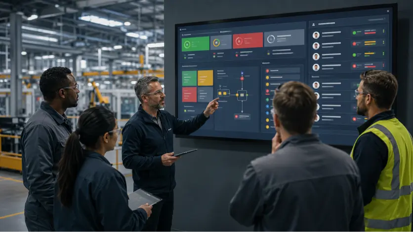
For Operations Directors, Plant Managers and CI Leaders who are tired of watching the same problems resurface in every morning meeting. Every Monday morning, somewhere in a manufacturing plant, a team gathers around a screen. The dashboard is pristine. Green, amber, red. Someone explains why last week’s OEE dipped to 68%. Actions are noted. The meeting ends. By Friday, half of those actions are still open – and next Monday, the same conversation begins again. This is not a data problem as you have more data than ever. This is a decision problem. And it’s costing you more than you think. Research from McKinsey shows that companies excelling at fast, high-quality decision-making are twice as likely to deliver returns of 20% or more – and the average Fortune 500 company loses an estimated $250 million annually to ineffective decision processes (source). Yet, most organizations keep adding data tools without fixing the decision architecture underneath them. According to Gartner, fewer than half of data and analytics leaders say their teams are effectively delivering business value, and analytics influence barely half of the decisions they’re supposed to inform. More data, more dashboards, and somehow, less action (source). The gap between knowing and doing is what separates a status report culture from an action engine culture. Digital tierboards, built and deployed correctly, are the mechanism that closes that gap. Here’s how. The Real Problem Isn’t a Lack of Data – It’s Decision Latency Let’s assume you’re running tiered daily management meetings: Tier 1 on the floor, Tier 2 with middle management, Tier 3 with senior leadership – you already know the theory. Cascade information up, drive accountability down, solve problems at the right level. The framework is simple… So why does it so often devolve into a status update ritual? The answer lies in what researchers call Decision Latency, the invisible interval between the moment an issue occurs and the moment someone commits resources to fix it. It is the gap between detection and action and in most organizations, this gap is neither measured nor managed (Gartner, 2026; McKinsey, 2024). In traditional manufacturing environments, the Decision Latency Index (DLI) can be 7 days or more. In digital-first organisations, it’s 1-3 days (The Agile Brand Guide, 2026). That gap represents days of waste, missed production windows, and compounding quality issues. “Adding more BI tools often increases latency rather than reducing it. Executives get more visibility but not more velocity. The result is decision friction – teams waiting for clarity rather than acting with courage.” – Karol Dabrowski, CEO at EviView The root cause is almost always the same: dashboards are built to report on the past, not to drive action in the present. When data arrives outside the cadence at which decisions are actually made, it doesn’t inform action … it just adds noise. The transition from dashboard-as-report to tierboard-as-engine requires a different architecture entirely. What Makes a Tierboard an “Action Engine”? A traditional dashboard answers the question: What happened? An action engine answers: What needs to happen right now, who owns it, and is it getting done? The distinction sounds simple, but the operational difference is significant. Here are the four characteristics that separate a status-report culture from an action-engine culture: 1. Exceptions Over Averages Most dashboards surface averages – last week’s OEE, this month’s downtime trend. Action engines surface exceptions – the machine that has failed three times this shift, the line where IPC completion is running 40 minutes behind, the safety near-miss that happened during the weekend handover. When your Tier 1 board highlights risks for the current shift before they escalate, you shift from reactive firefighting to anticipatory management. The question changes from “what went wrong?” to “what might go wrong in the next two hours?” 2. Decision-Ready Data Decision-ready data is information that allows an Operations Director to act before a problem compounds. It involves continuous data transformation, real-time visibility into task progress, and standardized insights that guide human decision-making without requiring a 30-minute data reconciliation exercise. The most effective tiered management systems follow a 40/20/40 rule: 40% of effort invested in preparation (sharing the right data before the meeting), 20% in the actual meeting (deciding and solving), and 40% in follow-up (tracking whether actions were completed). Most organisations invert this – spending 80% of their meeting time explaining data and almost nothing on structured follow-through. 3. Owner-Tagged Actions with Due Dates An action without an owner is a wish. A Tier 1 board that lists issues without assigning them to a named individual and a specific time for resolution will always drift toward status reporting. The physical or digital equivalent of “someone should look into this” is the single biggest contributor to the action gap. Effective tierboards make ownership visible and non-negotiable. When an escalation happens from Tier 1 to Tier 2, it carries a full audit trail: what the issue is, when it occurred, what was tried, and who owns resolution at the next level. 4. Structured Escalation Pathways Escalation is not a failure – it is a system. When an issue cannot be resolved at Tier 1, it should be documented and escalated to Tier 2 automatically and without friction. This ensures that problems don’t linger at the wrong level or fall through the cracks between shifts. The interconnected nature of a well-designed tiered structure creates a single source of truth from the shop floor to the boardroom, one that reflects reality in real time rather than in next week’s report. The Anatomy of a Tiered Management System That Actually Works For context, a well-functioning tiered management system typically operates across three or four levels: Tier 1: Frontline Staff & Team Leads: Daily/per-shift stand-ups (15 min). Focus: SQDP (Safety, Quality, Delivery, People). Outcome: Immediate countermeasures and owner-tagged actions.Tier 2: Middle Management & Support: Daily. Focus: Systems of work and cross-functional bottlenecks. Outcome: Resource allocation and escalation resolution.Tier 3: Senior Leadership: Weekly/Monthly.Focus: Strategic initiative progress.Outcome: Alignment between operational performance and business goals.Tier 4: Executive Committee: Monthly/Quarterly. Focus:
Heinrich’s Pyramid in 2026: What Modern EHS Teams Actually Use It For

The safety pyramid arranges workplace incidents by severity: a single serious injury at the apex, a larger band of minor injuries below it, and a wide base of near misses and unsafe conditions supporting both. Nearly every safety induction in manufacturing has shown a version of it. Its longevity is remarkable given how little scrutiny it survived. The pyramid is now roughly ninety five years old, has been revised once with materially different numbers, and has been the subject of a research finding that undermines the use most sites make of it. Yet it still appears on wall boards, largely because the alternative to a memorable image is usually no image at all. The model deserves neither the reverence nor the dismissal it tends to receive. It is worth knowing precisely what it claimed, what held up, and which parts of a modern safety programme it can honestly support. A Model Assembled From Insurance Claims Herbert William Heinrich worked in the engineering and inspection division of an insurance company, which gave him access to a large volume of accident claim files. In 1931 he published an analysis of them, and two findings from it entered the profession permanently. The first was a ratio. For every major injury, Heinrich counted 29 minor injuries and 300 accidents that caused no injury whatsoever. Drawn as a triangle, this became the image everybody knows. The second finding travelled further and did more harm. Heinrich attributed 88 per cent of accidents to the unsafe acts of workers, 10 per cent to unsafe mechanical or physical conditions, and 2 per cent to the unpreventable. That single percentage licensed decades of safety programmes aimed squarely at operator behaviour, poster campaigns about carelessness, and investigations that stopped at the person nearest the machine. Both figures now rest on nothing that can be examined. The claim files Heinrich reviewed were never published and no longer survive. A profession reproduced his ratio for ninety years without anybody being able to check it. Bird Repeated the Exercise and Got Other Numbers Frank Bird ran a much wider study in 1969, drawing on well over a million incident reports from companies across a broad span of industries. He found the same general shape and quite different proportions. Heinrich, 1931 Bird, 1969 Serious injury 1 1 Minor injuries 29 10 Property damage Not recorded 30 Near misses 300 600 Read those columns against each other, because they contain the most useful lesson the pyramid has to offer. Two competent analyses of large incident datasets differed by a factor of three at the minor injury band and doubled the base. Bird also introduced a category, property damage, that Heinrich had not counted at all. Ratios describe the population they were drawn from. They shift with industry, with era, with what a company chose to record, and with how honestly its workforce reported. A pharmaceutical site that expects to find exactly 300 near misses under each serious injury has mistaken an average from another century for a property of the physical world. The Question the Pyramid Never Answered Look closely at what the model actually asserts. It sorts events by severity and counts them. That is all. Somewhere in the retelling, this became a causal claim: that the small events at the base produce the large ones at the apex, and that grinding down the base must therefore shrink the top. Neither Heinrich nor Bird demonstrated this, and a correlation between the layers would arise anyway from a simple fact, which is that a plant exposing people to more hazard generates more of every category of incident. Suppress the near misses and a site suppresses its near misses. Whether the fatality risk moves at all depends on something the pyramid is silent about, namely whether the events at the top and the bottom arise from the same conditions. Injury Rates Fell. Fatalities Held Steady. That silence turned out to matter enormously. Through the 2000s a pattern surfaced across heavy industry, and once named it was recognised almost universally. Recordable injury rates had declined year after year under sustained behavioural safety effort. Fatality rates had barely shifted. Organisations celebrating a decade of improving lost time injury figures were killing people at approximately the rate they always had. The explanation is now widely accepted. Minor injuries overwhelmingly come from routine, low energy exposures: a slip on a wet walkway, a strain lifting a drum, a laceration from a sharp edge on a guard. Fatalities come from high energy exposures and from the failure of controls meant to be absolute. Working at height. Stored electrical or hydraulic energy. Vehicle and pedestrian interaction. Confined spaces. Uncontrolled release of chemical or thermal energy. A wet floor and a defeated press interlock are both incidents. Beyond that they have almost nothing in common, and no amount of attention to the first will discover the second. A site can watch its injury frequency rate fall for four consecutive years while walking steadily toward a fatality, and its safety dashboard will show green throughout. What Actually Survives Three uses hold up, and they are narrower than the model’s reputation suggests. The base contains a site’s only free information. Near misses and unsafe conditions are the sole category of incident that arrives without a cost attached, and they arrive in quantity. That is a strong argument for capturing every one of them, and it says nothing about ratios. Severity as recorded is a bad organising principle, and severity as possible is a good one. The spanner dropped from a gantry is the same event whether it lands on concrete or on somebody’s shoulder, and chance decides which. Sorting the base by what could plausibly have happened, rather than by what did, pulls the handful of events that share causes with a fatality out of the ninety that describe housekeeping. That sorting only works if every supervisor on every shift applies the definitions identically, which makes data standardisation the precondition for the entire exercise
Near Miss Reporting in Manufacturing: Turning Signals Into Action

Near miss reporting is the practice of recording incidents that could have caused injury, damage, or loss but did not. A tool dropped from a gantry that hit nobody, a forklift that stopped a metre short, a valve opened against the wrong isolation and caught before anything discharged: each of these is an event with a real cause and no consequence, and each one is a description of an accident the site has not had yet. The logic of near miss reporting is that consequence is often the least stable part of an incident. The same sequence of events, repeated on a different day, puts somebody underneath the dropped tool. Sites that treat the harmless version as information get to fix the cause. Sites that treat it as a non-event wait for the version that hurts somebody. Why Manufacturing Sites Underreport Reporting rates are the single most misread number in safety. A site with fifteen near miss reports a year does not have a safe plant. It has a quiet one. Underreporting has consistent causes, and none of them are that operators do not care about safety. The first is that nothing visibly happens. An operator submits a report, and it disappears into a system that returns no acknowledgement, no action, and no explanation. Reporting becomes an unpaid administrative task with no observable output, and it stops. The second is friction. A paper form kept in the supervisor’s office, filled in at the end of a shift from memory, competes directly with going home. Reports are made at the moment they are easy to make, which means they are made on the floor within a minute of the event, or they are not made at all. The third is fear. Where investigation has historically ended with somebody being disciplined, the workforce learns that reports produce blame rather than fixes. This does not need to be a formal policy. It needs one supervisor, once, in front of witnesses. The fourth is definitional. Operators cannot report what they do not recognise. A near miss that everybody accepts as a normal part of the job, the coupling that always sprays a little, the guard that has been awkward for years, has been reclassified as the way things are. What Good Reporting Looks Like A working near miss reporting system has a shape that can be described in a sentence: reports are easy to raise, quick to acknowledge, investigated for cause, closed with an action, and fed back to the person who raised them. Each part carries weight. Easy to raise means seconds, at the point of work, from wherever the operator is standing. Anything that requires locating a form, finding a supervisor, or waiting until the shift ends has already lost most of the reports it would otherwise have received. Quick to acknowledge means the same day, by a person rather than a system. Acknowledgement is what teaches the workforce that reporting has an effect, and it is the cheapest intervention available to any site trying to lift its reporting rate. Investigated for cause means treating a near miss with the same method as an injury. The consequence differed. The causes did not. Closed with an action means an owner, a date, and verification that the control is present. Reports without actions produce a database. Actions without verification produce a spreadsheet. Fed back means the person who raised the report learns what changed. This closes the only loop that matters for participation, and it is the step sites skip most often. Making Reporting Frictionless The reporting mechanism has to reach the point of work. Where hazards are raised digitally at the machine, on a shared device or a personal one, reports arrive with the detail intact, because the operator is describing something that happened four minutes ago rather than reconstructing it seven hours later. That immediacy also fixes a problem that paper cannot. A photograph attached at the moment of the event tells an investigator more than three paragraphs written afterwards, and it removes the ambiguity that makes so many reports unusable. The connected worker idea rests on this. An operator who can raise an issue in twenty seconds and see it appear on the supervisor’s board before the end of the shift is participating in the safety system rather than being audited by it. Getting the Report to the Right Conversation A near miss report that reaches a safety inbox has reached the wrong destination. It needs to reach the people who set the conditions the near miss occurred in, and those people are in the daily production meeting. Where near misses are reviewed at the daily huddle alongside output and quality, they get discussed by the person who scheduled the changeover, the person who deferred the maintenance, and the person who agreed the overtime, which is where most of the causes live. Where they need escalation, tier meetings carry the ones that a shift cannot resolve upward, with the record intact. A near miss caused by a guard design fault belongs in front of engineering. A near miss caused by chronic understaffing on nights belongs in front of the site leadership team, and it belongs there as a documented pattern rather than a complaint. Investigating Without Blame The investigation determines whether reporting survives. A near miss investigation that concludes an operator was careless has explained nothing, because carelessness is the description of an outcome rather than a cause. The useful questions ask why the error was easy to make and hard to catch. The structured method keeps the investigation honest. A fishbone analysis forces consideration of method, machine, material, environment, and management alongside the person, and it makes it visible when an investigation has stopped at the first name it found. Sites that apply root cause analysis to near misses with the same rigour they apply to reportable injuries tend to see reporting rates rise, because the workforce watches what happens to the first few reports and calibrates accordingly. Measuring
Tiered Meetings Are No Longer a Lean Exercise – They’re the Operating System of Modern Manufacturing

Why 24/7 Manufacturers Are Rebuilding Operational Excellence Around Digital Daily Management Across modern manufacturing, operational complexity has reached a level where traditional communication models are beginning to fail. Whether in pharmaceuticals, food and beverage, chemicals, medtech, automotive, industrial processing, or heavy manufacturing, today’s plants operate under enormous pressure to increase throughput, improve reliability, reduce downtime, and deliver more output from existing assets – all while managing increasingly leaner teams and more fragmented operating environments. And yet, despite major investments in automation, ERP systems, MES platforms, and analytics tools, many manufacturing sites still rely on surprisingly manual operational management processes. Critical information is often scattered across: The consequence is not simply inefficiency. It is operational fragmentation. Frontline issues are identified too late. Escalations lose momentum between shifts. Production, maintenance and quality teams operate with different versions of the truth. Managers spend mornings reconstructing what happened overnight instead of solving problems proactively. Over time, this creates a reactive operational culture where firefighting becomes normalized. This is precisely why tiered meetings, once viewed primarily as a Lean manufacturing routine – are evolving into something much more important. They are becoming the operational nervous system of the modern manufacturing plant. The Hidden Cost of Operational Disconnect In most 24/7 manufacturing environments, operational losses rarely come from one catastrophic failure. More often, performance erodes through hundreds of small disconnects: Individually, these issues appear manageable. Collectively, they create substantial operational drag. A 2026 study published in the journal Systems by MDPI examining closed-loop Lean routines in pharmaceutical manufacturing highlighted how fragmented daily management structures and disconnected escalation pathways reduce operational responsiveness and delay issue resolution across production environments. The research emphasized that standardized digital management routines improve visibility, escalation discipline, and continuous improvement execution in 24/7 operations. The issue is not that manufacturers lack data. Most manufacturing organizations already have enormous volumes of operational information. The issue is that operational data often remains disconnected from operational execution. This is where modern tiered meeting structures are becoming strategically important again. Why Tiered Meetings Matter More Than Ever At their core, tiered meetings are designed to create alignment, visibility, accountability, and escalation across the organization. But their real value is often misunderstood. High-performing manufacturers do not use tier meetings simply to “review KPIs.” They use them to create operational rhythm. That rhythm ensures issues move rapidly: The goal is not more meetings. The goal is faster operational learning loops. And in continuous manufacturing environments, speed of operational learning becomes a competitive advantage. Tier 1: Where Operational Reality Surfaces Tier 1 meetings sit closest to the shop floor and therefore closest to operational truth. In most 24/7 environments, Tier 1 operates in two parts. The first is the end-of-shift handover – typically occurring every 8 to 12 hours during shift transition. This is one of the most operationally sensitive moments inside any manufacturing plant. Because when handovers fail: Many organizations still rely on paper logs, static spreadsheets, or verbal updates during this process. In continuous operations, those communication gaps create enormous hidden operational risk. The second layer is the daily day-staff alignment meeting, usually held Monday to Friday at the beginning of the working day. This meeting serves a fundamentally different purpose. It synchronizes operations, engineering, maintenance, quality, and leadership around current plant status before the day accelerates. What is particularly interesting is how the operational focus shifts throughout the manufacturing week. Monday huddle meetings tend to be significantly more detailed and longer because many sites operate weekends with reduced management and support coverage. Teams often arrive Monday morning needing to assess operational drift, review unresolved issues, and regain alignment against production plans. EviView’s own operational workshops identified this repeatedly across manufacturing sites: “Monday morning scramble for information on what happened over the weekend.” Friday meetings, by contrast, are less retrospective and more preventative. The objective becomes preparing the facility for weekend autonomy: This operational cadence may appear simple on the surface. But in practice, it creates the communication discipline required to stabilize complex manufacturing environments. The Evolution From SQD to SQDP As tiered management systems mature, the operational focus also evolves. Historically, many manufacturers centered operational reviews around SQD: Increasingly, however, leading organizations are moving toward SQDP: This shift matters. Because manufacturing performance is no longer viewed solely through output metrics. The “People” dimension acknowledges a growing operational reality: plants cannot scale efficiently without engaged, accountable, and operationally aligned teams. At the same time, “Deliverability” reframes operational performance around consistency and execution reliability – not simply production volume. According to Lean performance management research referenced within the Digital Daily Management framework, organizations with structured visual management and standardized escalation routines demonstrate stronger operational consistency and reduced process variability. In practice, Tier 2 meetings become the tactical center of the operation: The Most Important Principle Most Manufacturers Still Underestimate One of the strongest operational insights within high-performing tiered management systems is not technology. It is ownership. More specifically: the Directly Responsible Individual (DRI) model – an accountability framework originally pioneered by Steve Jobs at Apple to eliminate ambiguity and ensure absolute task ownership. Many manufacturing organizations unintentionally create environments where: everyone discusses the KPI, but nobody truly owns the outcome. The result is operational ambiguity. Issues remain open across multiple shifts because accountability becomes diluted across teams and departments. The DRI model changes this fundamentally. Every KPI, escalation, corrective action, deviation, and operational issue must have a clearly assigned owner responsible for driving resolution. Importantly, the DRI is not necessarily the person completing every task. They are the individual accountable for ensuring progress happens and escalation occurs when required. This becomes particularly powerful in 24/7 manufacturing because unresolved issues can no longer disappear during shift transition. Ownership becomes visible. And visibility drives accountability. Why Traditional Tiered Meetings Are Breaking Down Many manufacturers still operate tier meetings using: The problem is not simply administrative inefficiency. The real issue is delayed operational intelligence. By the time issues reach leadership: This reactive model becomes increasingly unsustainable in high-speed manufacturing environments where
Job Hazard Analysis: A Step by Step Guide for Manufacturing Teams

A job hazard analysis is a structured method for breaking a task into its individual steps, identifying the hazards present at each step, and deciding on controls before the work begins. It is sometimes called a job safety analysis, and the two terms describe the same exercise. The output is a short, specific document that says what could go wrong during a particular job and what will be done about it. The value of a job hazard analysis lies in its scope. A site risk assessment considers the plant. A job hazard analysis considers the person standing in front of the machine at two in the morning with a spanner in one hand. That narrowing is what makes it useful, and it is also what makes it easy to do badly, because a task that everybody performs every day is the hardest task to see clearly. When a Job Hazard Analysis Is Needed Not every task warrants one, and a site that tries to analyse everything will produce a filing cabinet rather than a safer operation. The jobs that repay the effort share a few characteristics: That last one is the most revealing and the most ignored. Where the written method and the actual method have drifted apart, the hazard sits in the gap between them. Step One: Choose the Job and Set Its Boundaries A job hazard analysis needs a clear start and a clear end. “Operating the filling line” is too broad to analyse. “Changing the filling nozzle between batches” has a beginning, an end, and a manageable number of steps. Where a task runs longer than around ten steps, it is usually two tasks wearing one name, and splitting it produces better analysis than compressing it. Step Two: Involve the People Who Do the Job The operator who has performed the task four hundred times knows things the procedure does not record. Which guard has to be lifted because the interlock sticks. Where the tool is actually kept. What everybody does when the line is running behind and the correct method takes six minutes longer. None of that information arrives if the analysis is conducted by a safety adviser at a desk. It arrives when somebody watches the job being done and asks about the parts that look improvised. Poor communication in manufacturing is why so many hazard analyses describe a version of the job that nobody performs. Step Three: Break the Job Into Steps Each step describes one action, phrased as a verb: isolate the supply, release residual pressure, remove the guard, lift the nozzle clear. Steps describe what happens, and they leave out how well or how safely it happens, because judgement belongs in the next column. Ten steps is a reasonable ceiling. Fewer than four usually means the analysis has skipped something, and the skipped part is often the preparation or the return to service, which is where a surprising share of injuries occur. Step Four: Identify the Hazards at Each Step For every step, the question is what could cause harm, to whom, and by what mechanism. Stored energy, moving parts, chemical exposure, temperature, height, manual handling, noise, and access are the categories that recur in manufacturing. Environmental hazards belong here too: a spill during nozzle removal is a hazard whether or not anybody is injured by it. The discipline is specificity. “Chemical exposure” is a category. “Residual caustic in the line discharges toward the operator’s face when the coupling is released” is a hazard, and only the second version tells anybody what control is required. Step Five: Decide the Controls Controls are chosen in order of preference, and the order matters because auditors and, more importantly, outcomes both depend on it. Eliminate the hazard if the job can be redesigned to remove it. Substitute a less hazardous material or method. Apply engineering controls that work without anybody remembering to use them, which is the logic behind poka yoke and every physical interlock ever fitted. Then administrative controls such as procedures, permits, and training. Personal protective equipment sits last, because it protects one person, only while worn correctly, and only until it fails. A job hazard analysis that reaches PPE at every step has documented the hazards without controlling them. What the Finished Document Looks Like A job hazard analysis is conventionally recorded in three columns. Keeping it to three is deliberate, because the moment a form grows to nine columns it becomes something people fill in afterwards. Job step Hazard Control Isolate the product supply Line remains pressurised, unexpected discharge Lock off, tag, and verify zero pressure at the gauge Release the coupling Residual caustic sprays toward the operator Drain to the catch pot first, face shield and gauntlets worn Remove the nozzle assembly Assembly weighs 14 kg, awkward reach above shoulder height Two person lift, or use the mounted jib Fit the replacement nozzle Cross threading damages the seal, later leak in production Torque wrench to spec, second person verifies Return to service Guard left unsecured, isolation not removed Return to service checklist signed by the shift lead The rows above are illustrative. The point they carry is that a good control is testable. Somebody can walk up during the job and see whether it is in place. Step Six: Put It Where the Work Happens An analysis that lives in a folder in the office has controlled nothing. The findings need to reach the people doing the job, at the time they do it, which usually means the procedure is updated, the training is refreshed, and the specific hazards are raised at the shift briefing before the task begins. Handover deserves particular attention. Where a job spans a shift boundary, the hazards travel with the incomplete work. Half of what makes poor shift turnover dangerous is that the incoming crew inherits a condition, an isolation, or a partially reassembled machine without inheriting the analysis that described its risks. Step Seven: Review It Before It Goes Stale A job hazard
What an HSE Management System Looks Like in Manufacturing

An HSE management system is the structure a manufacturing site uses to manage health, safety, and environmental risk as a single, connected discipline. It brings together hazard identification, risk assessment, controls, training, incident investigation, corrective action, and performance monitoring, and it holds them in one framework rather than three separate ones. That definition is easy to write and hard to recognise on a real site. Most manufacturers already have every component of an HSE management system somewhere in the building. What they lack is the connective tissue: a way for a hazard raised at seven in the morning to become an assigned action by nine, a closed action by Friday, and a line in the management review by the end of the quarter. What an HSE Management System Is Made Of The parts of an HSE management system carry different names across standards and companies. The parts themselves rarely change. Policy sets the intent and the accountability. Risk management identifies hazards and decides what will be done about them. Operational control turns those decisions into procedures, permits, training, and equipment. Incident management handles what happens when a control fails. Performance monitoring tracks whether the system is doing what it claims. Review closes the loop by feeding what was learned back into policy and risk. Here is what each of those looks like when it stops being a document and starts being work. System element What it looks like on a working shift Policy and accountability Named owners for each risk area, visible on the board Risk management A live hazard register that operators can add to Operational control Procedures and permits available at the point of work Incident management Investigations that reach a cause and produce an action Performance monitoring Leading indicators reviewed daily, and lagging indicators monthly Review Findings and overdue actions escalated through the tiers The right hand column is where systems succeed or fail. The left hand column is what gets audited. How an HSE Management System Runs Day to Day It Starts at the Shift Boundary Most HSE risk transfers between people at handover. An isolation left partially complete, a spill that was contained rather than cleaned, a permit still open on a vessel: each of these depends on somebody telling somebody else. A structured shift handover process is the first control in the system, because everything downstream assumes the incoming shift knows what the outgoing shift knew. It Surfaces in the Daily Huddle Safety belongs at the start of the daily huddle, before output is discussed, and it belongs there as a conversation rather than a formality. Yesterday’s near misses, today’s high risk work, open actions that are running late. Three minutes of it, every day, does more for hazard reporting rates than an annual campaign. The huddle also settles the question that quietly determines whether the whole system works: when an operator reports something, does anything visibly happen? If the answer is yes, reporting rates climb, and the site starts seeing the small signals that precede serious incidents. If the answer is no, reporting collapses to whatever the law demands. It Makes Status Visible Visual management turns the state of an HSE management system into something a supervisor can read from across the room. Open actions, overdue items, days since the last recordable incident, current audit findings. The point is not decoration. It is that a supervisor with fifteen minutes and no data cannot prioritise, and a supervisor with a board can. Where issues need to be owned rather than merely displayed, gemba boards do the work, tying each observation to a person and a date. It Investigates Properly Incident management is where a health and safety management system reveals its real maturity. An investigation that concludes with retraining, or with a reminder to follow the procedure, has stopped at the first plausible cause. Structured methods exist for a reason, and a fishbone diagram run properly will usually push past the operator to the conditions that made the error likely: time pressure, poor lighting, a procedure that no longer matches the plant, a control that had been quietly defeated for months. It Measures the Right Things Lagging indicators, meaning injuries, spills, and reportable events, describe what already went wrong. They are necessary and insufficient. A system that manages risk needs leading indicators too: hazard reports raised, actions closed on time, audits completed, training current, permit compliance, near miss quality. Sound KPI management treats those as operational numbers reviewed at the same cadence as output, because that is the only way they compete for attention. The trap is measuring what is easy to count. A site can report a hundred per cent training completion and still have a workforce that cannot explain the top three risks on its own line. What an HSE Management System Needs in Regulated Manufacturing In pharma, biopharma, and chemical operations, HSE sits alongside quality in a way that shapes everything about the system. Evidence carries the same weight as action. A control that was applied but never recorded is, for practical purposes, a control that was never applied. Records need to be attributable, legible, contemporaneous, and durable, and the same expectations that govern batch records eventually reach safety records too. Multi site groups add a second demand. A hazard category counted one way in Cork and another way in Singapore produces a group safety report that means nothing. Centralised multi site operations depend on definitions being agreed once and applied everywhere, which is unglamorous work that almost always precedes any useful group level analysis. Where HSE Management Systems Break Down Three failures repeat, and none of them look dramatic while they are happening. The system runs parallel to the operation. Safety has its own software, its own meeting, its own manager, and its own actions, and none of them touch the production conversation happening two doors away. Risk gets managed in a room where nobody is making the decisions that create it. The system generates actions it cannot close.
ISO 45001: What the Standard Requires and How Sites Meet It

ISO 45001 is the international standard for occupational health and safety management systems. It sets out what an organisation has to do to identify hazards, control risk, and prevent harm to everyone who works on its sites, including employees, contractors, and visitors. It was published by the International Organization for Standardization and applies to any organisation, of any size, in any sector. The standard describes what a health and safety management system has to achieve. The method is left to the organisation. That distinction matters more than it first appears, because it means two certified sites can run their safety systems in completely different ways and both be compliant. What they share is the underlying logic: understand the risk, put controls in place, check that the controls work, and improve them when they fall short. Where ISO 45001 Came From For most of the two decades before ISO 45001 existed, the reference point for health and safety management was OHSAS 18001, first published in 1999 by a group of national standards bodies and certification houses. It was widely adopted and reasonably well respected. It was also never a true ISO standard, which limited how neatly it could sit alongside the quality and environmental systems most manufacturers were already running. Work on a proper international standard began in 2013. ISO 45001 was published in March 2018, after a drafting process that ran longer than planned and drew comment from more than seventy countries. Organisations holding OHSAS 18001 certification were given a transition period to migrate, and that window closed in 2021. OHSAS 18001 is now withdrawn. What Changed in the Move from OHSAS 18001 Three shifts are worth understanding, because they explain why ISO 45001 feels different to live with. The first is context. ISO 45001 asks an organisation to look outward at the conditions it operates in: regulators, supply chain, community, workforce demographics, and anything else that shapes safety performance. The second is leadership. Responsibility for the safety management system sits with top management and cannot be delegated to an EHS function. The third is worker participation. The standard is explicit that workers at all levels must be consulted on hazards, controls, and the design of the system itself, and that barriers to their participation must be removed. Taken together, these moved health and safety out of the safety office and into the way the site is run every day. How the Standard Is Structured ISO 45001 follows the harmonised structure that ISO uses across its management system standards, which is why it maps cleanly onto ISO 9001 for quality and ISO 14001 for environment. Clauses one to three cover scope, references, and definitions. The requirements sit in clauses four to ten. Clause four covers the context of the organisation and the needs of interested parties. Clause five covers leadership, policy, roles, and worker consultation. Clause six covers planning, which is where hazard identification, risk assessment, legal requirements, and safety objectives live. Clause seven covers support: competence, awareness, communication, and documented information. Clause eight covers operation, including operational controls, management of change, procurement and contractors, and emergency preparedness. Clause nine covers performance evaluation through monitoring, internal audit, and management review. Clause ten covers improvement, including incident investigation, corrective action, and continual improvement. The whole thing runs on the PDCA cycle. Clauses six and seven plan, clause eight does, clause nine checks, and clause ten acts. The Hierarchy of Controls One requirement inside clause eight tends to shape day to day EHS work more than any other. When a hazard has been identified, the standard requires controls to be applied in a set order of preference: eliminate the hazard first, then substitute it for something less hazardous, then apply engineering controls and reorganise the work, then apply administrative controls such as procedures and training, and only then rely on personal protective equipment. Auditors look for evidence that this order was genuinely followed. A risk assessment that jumps straight to PPE and training, without any record of whether elimination or engineering controls were considered, is a common finding. How a Site Adopts ISO 45001 The sequence below is roughly what implementation looks like from the first meeting to a certificate on the wall, and it usually takes somewhere between nine and eighteen months depending on where the site is starting from. Gap Analysis and Scope Work begins by defining which sites, activities, and workers the system will cover, then comparing what already exists against what the standard requires. Most manufacturing sites discover they are already doing perhaps sixty per cent of the work, and that the gaps are in evidence, consultation records, and management review rather than in the safety controls themselves. Building the System Next comes the policy, the hazard identification and risk assessment method, the register of legal and other requirements, the objectives, and the operational controls. This is also when responsibilities are assigned and competence requirements are set. The temptation at this stage is to write a large volume of documentation and call it a management system. Documentation on its own certifies nothing. Internal Audit and Management Review Before any certification body arrives, the organisation has to audit itself against the standard and hold a formal management review covering performance, incidents, audit findings, and the status of objectives. Internal audit maturity is usually the clearest signal of whether a site is ready. Certification and the Three Year Cycle Certification runs in two stages. The first checks that the system exists and is documented. The second tests whether it is working in practice, which means talking to operators, watching work happen, and tracing incidents through to closure. Certificates last three years, with surveillance audits each year and a full recertification at the end. Certification itself is voluntary, and plenty of organisations conform to the standard without being certified to it. What ISO 45001 Means for Daily EHS Operations This is where the standard stops being a document and starts being a way of working. Hazard and near miss reporting
Value Stream Mapping in Pharma Manufacturing: A Practical Guide

Most improvement efforts in pharma manufacturing start by looking at the steps that add value: the reaction, the fill, the pack. Yet in a typical pharma value stream, those steps account for a tiny fraction of the total time a batch spends in the building. The rest is waiting. Waiting for testing, waiting for review, waiting for release. Value stream mapping is the tool that makes this visible, and once a team sees it, the real opportunities to shorten lead time become hard to ignore. Value stream mapping is a lean technique for drawing the entire flow of a product, from raw material to finished goods, taking in both the work itself and the information that drives it. It is used across manufacturing, but it has a particular power in pharma, where regulation, testing and documentation stretch lead times far beyond the time spent actually making anything. This guide explains what value stream mapping is, why it matters in a regulated plant, and how to build a map that leads to real change. What Value Stream Mapping Is A value stream is every step required to bring a product from start to finish. A value stream map is a single diagram of that flow, drawn at a level that shows the whole journey on one page rather than the detail of any single step. It captures three things at once: the sequence of process steps, the inventory and waiting that sits between them, and the flow of information that tells each step what to make and when. What sets value stream mapping apart from an ordinary process map is the timeline drawn along the bottom. It separates the time a product spends being worked on from the time it spends waiting, and the gap between the two is usually startling. A batch may take days or weeks to move through a plant while the hands on work amounts to hours. Seeing that contrast on a single line is what turns a vague sense that things are slow into a clear target. Disciplines such as lean six sigma lean heavily on exactly this kind of visibility. Why Value Stream Mapping Matters in Pharma In many industries the steps that add value also take most of the time, so improvement focuses on speeding them up. Pharma is different. The making is often quick, but each batch then enters a long sequence of quality and compliance activities: in process checks, lot release testing, batch record review, deviation handling and final QA approval. These steps are essential and cannot be removed, yet they are where most of the lead time hides. That changes where value stream mapping pays off. A map of a pharma value stream tends to show modest processing times separated by long stretches of waiting, much of it in testing queues and document review. The improvement target is rarely the processing step itself. It is the white space between steps, the handoffs, the queues and the delays in getting information to move. Because these delays are bound up with quality systems, the goal is to make the necessary work flow faster rather than to cut the work itself, which keeps the value stream both quicker and compliant. How to Build a Value Stream Map A value stream map is built in a clear sequence. The work is collaborative and best done by the people who run the process, walking the real flow rather than mapping it from a meeting room. Choose one value stream and walk it A plant has many value streams, so the first step is to pick one, usually a single product family whose items share similar steps. The team then walks it end to end, in the direction the product flows, starting at despatch and tracing back towards raw material so the focus stays on what the customer receives. Walking the flow in person surfaces the reality that a procedure document never shows. Map the current state The current state map records what actually happens today, step by step, with the inventory and waiting drawn in between. The point is honesty rather than neatness. A map that shows the process as it is meant to run is useless, because the waste lives in the gap between the official process and the real one. Reliable data driven manufacturing makes this far easier, because the team can build the map on recorded performance rather than estimates and memory. Add the data that matters A map without numbers is just a picture. Each step needs a few key figures attached: how long it takes to process, how long the product waits before it, how often it has to be reworked, and how reliably it runs. Production analytics and standardised data turn this from a guessing exercise into something defensible, and in a regulated plant defensible numbers matter as much as the improvement they point to. The timeline along the bottom then totals the processing time against the full lead time, and the ratio between the two is the headline result of the whole exercise. Find where time and value are lost With the current state mapped and measured, the waste becomes visible. Long queues before a testing step, batches held while paperwork catches up, information that travels slower than the product, rework loops that send a batch backwards. Each of these is a candidate for improvement, and the map makes it possible to size them rather than argue about them. Attention belongs with the biggest delays rather than the most irritating ones. Design the future state The future state map is the point of the whole exercise. It shows how the value stream should run once the worst delays are removed: tighter handoffs, testing pulled closer to production, information flowing in step with the product, fewer and shorter queues. The aim is a realistic next state rather than a perfect one, an operation that is meaningfully faster while still meeting every quality requirement. High volume value streams such as
Plant Shift Handover: Why It’s Still the Source of Operational Errors

Few activities in a plant are as routine as the shift handover, and few carry as much hidden risk. Two or three times a day, one team hands control of a live operation to another, passing on everything the incoming shift needs to keep things running safely. When it goes well, nobody notices. When it goes badly, the consequences surface hours later as a missed step, a repeated fault or an incident that traces straight back to something that was never passed on. The strange thing is that this is not a new or unknown problem. The plant shift handover has been recognised as a weak point for decades, yet it remains one of the most common sources of operational error on the shop floor. This article looks at why a plant shift handover still goes wrong so often, what those failures cost, and what separates a handover that protects an operation from one that quietly undermines it. What Happens During a Shift Handover A shift handover is the moment when responsibility for a process moves from the outgoing team to the incoming one. In those few minutes a great deal of information has to change hands: what ran during the shift, what stopped and why, which jobs are part finished, what is waiting on maintenance, which deviations are still open and what the next team needs to watch. A well structured handover process makes sure all of it travels intact. The difficulty is that this is also a moment of distraction. The outgoing team is tired and keen to leave, the incoming team is still settling in, and the handover often happens standing up, against the clock, with the noise of the floor in the background. Everything depends on a brief exchange at exactly the point when attention is hardest to hold. Why a Plant Shift Handover Still Causes Errors The reasons handovers fail are consistent and, for the most part, structural. They are rarely a matter of individuals not caring, and far more a matter of a process that leaves too much to chance. It relies on memory and word of mouth Many handovers still run on conversation alone. The outgoing operator recounts what happened from memory, and the incoming operator is expected to remember it. Memory after a long shift is selective, and detail drops out. The small fact that seemed minor at the time, a valve left in an unusual position or a reading that drifted slightly, is exactly the kind of thing that goes unspoken and later becomes a problem. The handover has no consistent structure When there is no agreed format, every handover is only as good as the person giving it. One operator covers everything methodically, the next mentions whatever comes to mind first and forgets the rest. Without a structure that prompts the same points every time, important information depends entirely on who happens to be on shift, and gaps open up at every changeover. Information is scattered across paper and systems Where records do exist, they are often spread across a paper logbook, a whiteboard, a spreadsheet and a few separate systems, none of which talk to each other. The incoming team has no single place to look, so they piece the picture together from fragments or simply trust the verbal summary. Moving to digital logbooks is one of the clearest ways to close this gap, because it gives every shift the same complete record rather than scattered notes. The changeover happens under time pressure A handover is squeezed into the overlap between two shifts, and that overlap is short. When a shift has run late or a problem is still live, the handover is the first thing to be compressed. Corners get cut, the summary gets shorter, and the incoming team starts already missing context. Time pressure turns a thorough exchange into a rushed one at precisely the wrong moment. Nobody has a shared view of the shift Underlying all of this is the lack of a single, shared picture of what actually happened. When performance data, open issues and outstanding actions live in different places, no two people see the same version of the shift. The outgoing team hands over their understanding, which may already be incomplete, and the incoming team inherits the gaps along with the job. What Poor Handovers Actually Cost The cost of a weak handover is easy to underestimate, because the failure and its consequence are separated by hours. A poor handover rarely causes an obvious problem on the spot. It plants one that surfaces later, when the incoming team acts on an incomplete picture. In regulated and safety critical operations the stakes are higher still. Safety regulators have long treated shift handover as a safety critical activity, and communication failures at the point of handover have been identified as a contributing factor in serious process industry incidents. Beyond safety, the everyday costs of bad communication add up quietly: a deviation that has to be investigated, a job redone because its status was unclear, an alarm that was already known about but never mentioned. Clear, reliable handovers are central to safe operations and to keeping avoidable losses off the books. What an Error Resistant Handover Looks Like A handover that protects an operation has a few things in common, whatever the industry. It follows the same structure every time, so the same points are covered whoever is on shift. It is written down rather than left to memory, creating a record the incoming team can read and refer back to. It draws on one shared record, so the verbal exchange and the data behind it agree. And it carries open issues forward explicitly, so nothing falls through the gap between shifts. Improving shift communication along these lines is less about adding effort and more about removing the chance for things to be missed. The same move that makes handovers more reliable also tends to make them faster, because a structured digital handover replaces the
The 7 Wastes of Lean Manufacturing: How to Spot Them on Your Shop Floor

Every manufacturing process contains work that adds value and work that does not. The trouble is that the work which adds nothing rarely announces itself. It hides inside routines that feel normal, in the extra walk to fetch a tool, the pallet of stock waiting for a machine, the report nobody reads. Lean manufacturing gives this hidden work a name. It calls it waste, and it sorts it into seven recognisable types. The 7 wastes come from the Toyota Production System, the foundation of modern lean principles, where they were identified as the main drains on productivity that creep into any operation over time. Learning to see them is one of the most useful skills a team can build, because waste that stays invisible never gets removed and reducing waste is where most lean gains come from. This guide walks through each of the 7 wastes of lean manufacturing in turn, with the everyday signs that give each one away on the shop floor. The 7 Wastes of Lean Manufacturing A common way to remember the seven is the word TIMWOOD, formed from the first letter of each: Transport, Inventory, Motion, Waiting, Overproduction, Overprocessing and Defects. The mnemonic is handy on a walk, though the real skill is recognising what each one looks like in practice. 1. Transport Transport waste is the unnecessary movement of materials, parts or product from one place to another. Moving things is sometimes unavoidable, but every extra journey adds time, risk of damage and cost while changing the product not at all. It tends to be a symptom of layout. When a part travels back and forth across a site between steps that could sit closer together, transport waste is usually the reason. On the floor it shows up as forklifts and trolleys in constant motion, materials crossing the same aisle several times, and long gaps between consecutive operations. A quick way to find it is to trace the path a single part takes from goods in to finished product. The more that line doubles back on itself, the more transport waste there is to remove. 2. Inventory Inventory waste is stock sitting idle: raw materials, work in progress or finished goods held in greater quantity than the process needs right now. Excess inventory ties up cash, takes up space and hides other problems, because a generous buffer lets a team carry on without noticing the breakdown or delay that created the pile in the first place. The signs are physical and hard to miss once you look for them. Stacks of work in progress between stations, storage areas filling up, batches made well ahead of demand, and stock that gathers dust before it is used. Tighter production scheduling is often where the cure starts, matching what is made to what the next step actually needs. 3. Motion Where transport is about moving the product, motion waste is about the unnecessary movement of people. It covers the reaching, bending, walking and searching that operators do because tools, materials and information are not where they need to be. Each movement is small, but repeated thousands of times a shift it adds up to real lost time and avoidable strain. Watch an operator at one station for a few minutes and the waste appears: steps taken to fetch a tool that could be within arm’s reach, time spent hunting for a document, awkward stretches for parts stored too far away. Well run 5S audits attack this directly, organising a workspace so everything an operator needs sits where the work is done. 4. Waiting Waiting waste is idle time, when people or machines stand ready but unable to work. It happens when a step is starved of what it needs. The previous operation has not finished, a material has not arrived, an approval is outstanding, or a machine has stopped and nobody is yet free to fix it. The resource is available and paid for, yet producing nothing. It is one of the easiest wastes to see and one of the most revealing. Operators standing idle, machines stopped mid shift, queues of work building in front of a bottleneck while earlier stations sit quiet. Honest downtime data turns these moments from anecdote into evidence, showing how often the waiting happens and what keeps causing it. 5. Overproduction Overproduction is making more than is needed, or making it earlier than it is needed. Lean treats it as the most serious of the seven, because it sets off most of the others. Producing ahead of demand creates inventory to store, transport to move it and waiting further down the line, and it ties up effort that could have gone to what the customer actually wants now. It often looks like productivity, which is exactly what makes it dangerous. Machines kept running to hold utilisation figures high, large batches made because the changeover is awkward, products built to a forecast that has already moved on. A shift towards steadier flow production, where each step makes only what the next one is ready to take, is the lasting answer. 6. Overprocessing Overprocessing is doing more to a product than the customer needs or values. It is effort spent on tolerances tighter than the specification, finishes nobody asked for, checks duplicated across several stages, or paperwork filled in twice because two systems do not talk to each other. The work feels diligent, yet it adds cost without adding worth. Spotting it takes a harder look than the others, because the activity is usually well intentioned. The questions to ask are simple. Does this step change anything the customer would pay for? Is this inspection already done elsewhere? Is this form recorded twice? Wherever the answer is no, overprocessing is quietly draining time and attention. 7. Defects Defects are products or outputs that fail to meet the standard and have to be scrapped, reworked or corrected. This is the most visible waste and often the most expensive, because a defect consumes everything already